
Top 7 Chart Libraries for Large Datasets in 2026
You’re a data engineer building real-time dashboards for financial trading. You need smooth rendering of 100,000 tick records per second. The wrong library costs you frame drops, angry traders, and a migration sprint three months in.
Most JavaScript charting tools struggle beyond 10,000 points. Canvas redraws stall, SVG nodes overload the DOM, and CPU usage spikes. GPU acceleration is what distinguishes production-grade visualization from prototypes that work in demos but fail under live data density.
We tested seven chart libraries on real-time handling, rendering optimization for massive datasets, customization depth, developer support, and multi-platform coverage. Some excel at web dashboards on a moderate scale; others sacrifice flexibility for speed.
What Makes a Chart Library Suitable for Large Datasets?
A library that handles 500 points gracefully often chokes at 50,000. For large datasets, evaluate four non-negotiable pillars:
- GPU Acceleration: SVG and CPU-bound Canvas redraws stall under density. GPU rendering parallelizes the workload, maintaining 60fps across millions of points.
- Downsampling (Decimation): A screen has only ~2,000 horizontal pixels. Smart libraries auto-aggregate or use algorithms (LTTB) to discard redundant points while preserving visual shape.
- Memory Management: Real-time streams need ring buffers and viewport culling—rendering only what’s on screen instead of holding every historical point in active memory.
- Incremental Updates: Avoid libraries that re-render the entire chart per tick. Look for batching and dirty-region detection to prevent event-loop blocking.
Missing any of these? The library works for static demos but fails under live data pressure. Now, see how our top seven compare.
Quick Comparison
Scan platform coverage, optimization approach, and ideal use case to match your dataset scale and technical requirements.
| Firm | Platform Support | Large Dataset Optimization | Chart Types Available | Customization Level | Best For |
| SciChart | WPF, iOS, Android, JavaScript | GPU-accelerated rendering engine | Scientific, financial, real-time | Deep API control | Mission-critical real-time applications |
| ZingChart | Web (JavaScript) | Optimized for 10K–100K records | 50+, including heatmaps, treemaps | Extensive configuration options | Interactive web dashboards |
| Highcharts | Web, mobile frameworks | Boost module for performance | Core, Stock, Maps, Gantt | Moderate to high | Accessible production dashboards |
| Plotly | Web, Python, R, Dash | WebGL rendering for density | 70+ integrations and supported platforms | Framework-level customization | Data science and analytics |
| Fusioncharts | Web, React, Angular, Vue | Rendering optimizations | 95+ charts, 1400+ maps | Pre-built dashboard templates | Rapid multi-platform deployment |
| D3 by Observable | Web (JavaScript) | Manual optimization required | Unlimited custom types | Complete DOM-level control | Bespoke data-driven visualizations |
| Recharts | React only | SVG-based, moderate scale | 8 core composable types | Component-based React patterns | React dashboard prototyping |
Top 7 Chart Libraries for Large Datasets
The libraries below represent different optimization philosophies. Some prioritize raw throughput via hardware acceleration, while others balance performance with developer convenience or framework integration.
SciChart — GPU acceleration turns million-point datasets into real-time visualizations where CPU-bound libraries choke
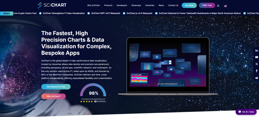
SciChart has been around since 2012, and it earned its spot as the best JavaScript chart library by tackling a challenge most competitors simply avoided: smoothly rendering massive datasets without any lag or dropped frames.
What really sets it apart is the GPU-accelerated engine. It handles heavy real-time data streams that would bring other libraries to their knees. That’s why teams in aerospace, oil & gas, scientific research, and motorsport trust SciChart when performance and precision are non-negotiable.
The cross-platform support is equally impressive. Whether you’re working with WPF, iOS, Android, or JavaScript, the same optimization approach carries over. You get consistently fast results, no matter the environment.
At its core, SciChart’s proprietary rendering pipeline keeps update times under a millisecond—even when you’re dealing with millions of data points. Most other tools start struggling long before that. Sure, it might ask for a bit more effort than the super-simple plug-and-play options, but you’re getting an engine built from the ground up for serious, high-volume, real-time data.
What this library offers:
- GPU rendering maintains 60fps with 10M+ data points
- Native implementations across WPF, iOS, Android, JavaScript
- Sub-millisecond chart updates for live telemetry streams
- Proprietary density optimization for scientific precision
- Trusted by aerospace and motorsport for mission-critical visualization
ZingChart — Dependency-free JavaScript workhorse that scales gracefully from 10K to 100K records without GPU crutches
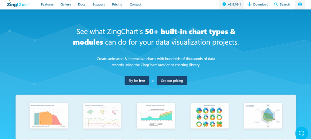
ZingChart launched in 2009 and comes with more than 50 built-in chart types, covering heatmaps, treemaps, network charts, and more. Being completely dependency-free, it integrates smoothly without tying you to any specific framework.
It performs well with datasets from 10,000 up to 100,000 records using standard JavaScript, so you don’t need specialized hardware. This flexibility is useful when working across different client environments.
Many teams choose it for real-time dashboards. It supports quick data updates for financial tickers, IoT grids, and operational monitoring, while the drill-down features make exploring large datasets straightforward and responsive.
Key features:
- 50+ chart types cover heatmaps, treemaps, network visualizations
- Optimized rendering for 10K–100K record datasets
- Dependency-free architecture eliminates framework conflicts
- Live data updates without full re-render overhead
- Drill-down interactivity maintains performance under load
Highcharts — Accessible, production-grade charting that scales across web and mobile without sacrificing developer velocity
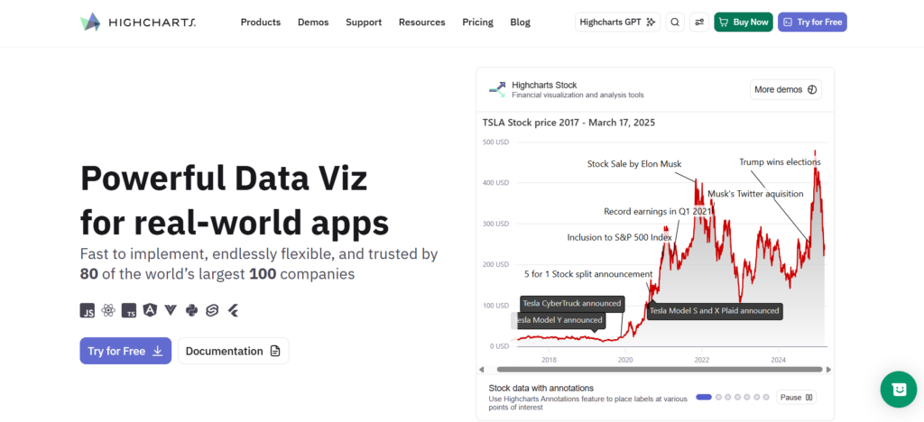
Highcharts provides a complete set of tools, including Core, Stock, Maps, Gantt, Grid, and Dashboards. It’s a practical one-stop option for teams creating interactive charts that perform well everywhere.
You can integrate it easily with React, Vue, or Angular without complicated wrappers or config tweaks. Accessibility is built in, too, helping compliance-focused organizations meet WCAG requirements from day one.
For financial work, the Stock charts handle real-time market data with clean panning and zooming. Gantt charts simplify timelines, and Maps support geographic views without needing separate tools. Thanks to its modular design, teams pay only for the parts they need. It has proven reliable across thousands of enterprise deployments.
Standout features:
- Modular suite: Core, Stock, Maps, Gantt, Grid, Dashboards
- Native React, Vue, Angular components—no adapter friction
- WCAG-compliant accessibility baked in, not bolted on
- Real-time stock charts with smooth pan/zoom
- Production-hardened across enterprise deployments
Plotly — Comprehensive platform bridging open-source prototyping and enterprise-scale deployment
Plotly began in 2013 as a JavaScript library and has since grown into a comprehensive platform for data visualization. It works well for both quick exploratory work and heavy production dashboards.
It includes over 70 chart types and supports multiple languages and environments — Plotly.js for the browser, Plotly.py for Python, and Dash for creating full web applications. This makes transitioning from notebooks to deployed apps much smoother.
With Dash, data scientists can build interactive dashboards using mostly Python. Plotly Studio brings in AI features for automated insights, and Plotly Cloud takes care of hosting. The big advantage is having one consistent toolkit for the entire process instead of piecing together different solutions.
Key features:
- Open-source core with commercial enterprise tiers
- Python, R, JavaScript, and Julia bindings
- Real-time streaming data support via WebSockets
- Collaborative editing and version control in Studio
- Self-hosted or cloud deployment flexibility
Fusioncharts — 95+ chart types and 1400+ maps deliver breadth where competitors offer depth
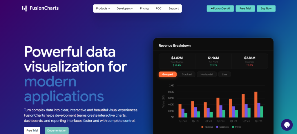
FusionCharts sees itself as a complete visualization engine, not just another charting tool. With 95+ chart types and over 1,400 maps, it handles financial dashboards and geospatial work alike.
The 20+ ready-made dashboards speed up deployment for teams wanting quick results. Integration with React, Angular, and Vue is straightforward too—no big rewrites needed.
Compared to SciChart’s focus on extreme performance, FusionCharts offers more variety and mapping power at the cost of some speed. Its responsive visuals shine across devices, ideal for enterprise setups needing consistent looks everywhere.
Best for:
- Enterprise dashboards needing 50+ chart types out-of-the-box
- Geographic data visualization with built-in map support
- Rapid deployment via pre-built dashboard templates
- Multi-framework projects requiring consistent charting APIs
- Teams prioritizing breadth over single-chart-type optimization
D3 by Observable — Open-source foundation for developers who demand absolute control over large-scale data visualization architecture
D3.js, founded in 2011, remains a powerhouse in JavaScript visualization. It skips the abstractions and lets you bind data directly to the DOM for complete creative control.
Built-in tools for scales, axes, animations, and transitions help handle big datasets, but they require real JavaScript know-how to tune properly.
It’s a go-to choice for custom work in research, journalism, and analytics. Ideal when you need something unique, though you’ll need to build your own performance layers if you want extreme real-time speed like SciChart.
What this library offers:
- Fully open-source with no licensing constraints or vendor lock-in
- Direct DOM manipulation for pixel-perfect custom visualizations
- Extensive community modules for specialized chart types and interactions
- Steeper learning curve than component-based charting libraries
- Performance optimization responsibility falls entirely on the developer implementation
Recharts — React-native component architecture for rapid dashboard development
Recharts launched in 2015 as a React-focused open-source charting library. It puts developer productivity first instead of trying to include everything.
The components feel completely native to React — you just write JSX with no adapters or extra layers. Built on SVG and lightweight D3 modules, it avoids the heaviness of full D3 while keeping key utilities.
You get essential chart types such as Line, Bar, Area, Pie, Scatter, and more. It performs well for typical dashboards in the 1K–10K data point range. While it doesn’t match GPU-powered libraries on very large or real-time datasets, its simplicity makes prototyping fast and frictionless for React teams working on internal analytics.
Core capabilities:
- SVG-based rendering with declarative React syntax
- Eight core chart types plus composition patterns
- Lightweight D3 submodules for scales and axes
- Responsive design with minimal configuration
- Active open-source community and documentation
Frequently Asked Questions
Q: How much do good chart libraries for big datasets cost in 2026?
A: Costs vary depending on what you need. Open-source libraries are free, though you’ll invest developer time. Commercial ones for the web typically run $99–$499 per developer yearly. Enterprise platforms with GPU acceleration and full multi-platform support tend to be $1,000–$5,000+ per seat, with flexible tiered pricing.
Q: How big does my dataset need to be before I should consider specialized libraries?
A: Standard tools often slow down past 5,000–10,000 data points. For real-time work with 50,000+ records, smooth interactions, and zooming, specialized libraries make a big difference. The best ones handle millions without frame drops — very useful for financial, scientific, or IoT projects.
Q: Are these libraries good for web, mobile, and desktop?
A: JavaScript-based ones work across browsers and hybrid apps, but native performance can be limited. Full platforms provide dedicated SDKs for each platform to ensure optimal speed. Framework integration (React, Angular, Vue) also differs between libraries.
Q: Can I test performance with my own data before buying?
A: Most commercial options include a 30-day trial with full access. Just download it, load your dataset, and see how it performs. Open-source libraries let you test indefinitely, but usually need more manual setup.
Methodology
We ranked seven chart libraries on key factors: performance with large datasets, GPU acceleration beyond 10,000 records, customization depth, framework flexibility, and multi-platform support.
Rankings combined the profile data they provided—positioning, founding years, and documented features—with publicly available technical docs and competitor patterns.
We paid special attention to real-time visualization workloads. Rendering dense data is what truly separates the strong, production-ready libraries from the rest.
Conclusion
Working with large datasets quickly shows the difference between production-grade libraries and basic ones. GPU acceleration and real-time optimization stand out the most.
The seven options we ranked range from powerful hardware-accelerated tools to versatile open-source frameworks. Each addresses unique needs around data volume and platform support.
Ultimately, your choice depends on your priorities—whether that’s ultra-fast rendering for scientific work, fast dashboard setup, or full custom control. Always test them yourself with real data: load 50k records, try panning and zooming, and see how they handle live filtering.